Case study visual system
How should
product thinking
look?
Four minimal visual treatments for Signals. Each slide fits a desktop viewport and can be captured as a standalone LinkedIn image.
01Evidence ledger
02Product focus
03Decision trace
04Research notes
Visual direction
Evidence ledger
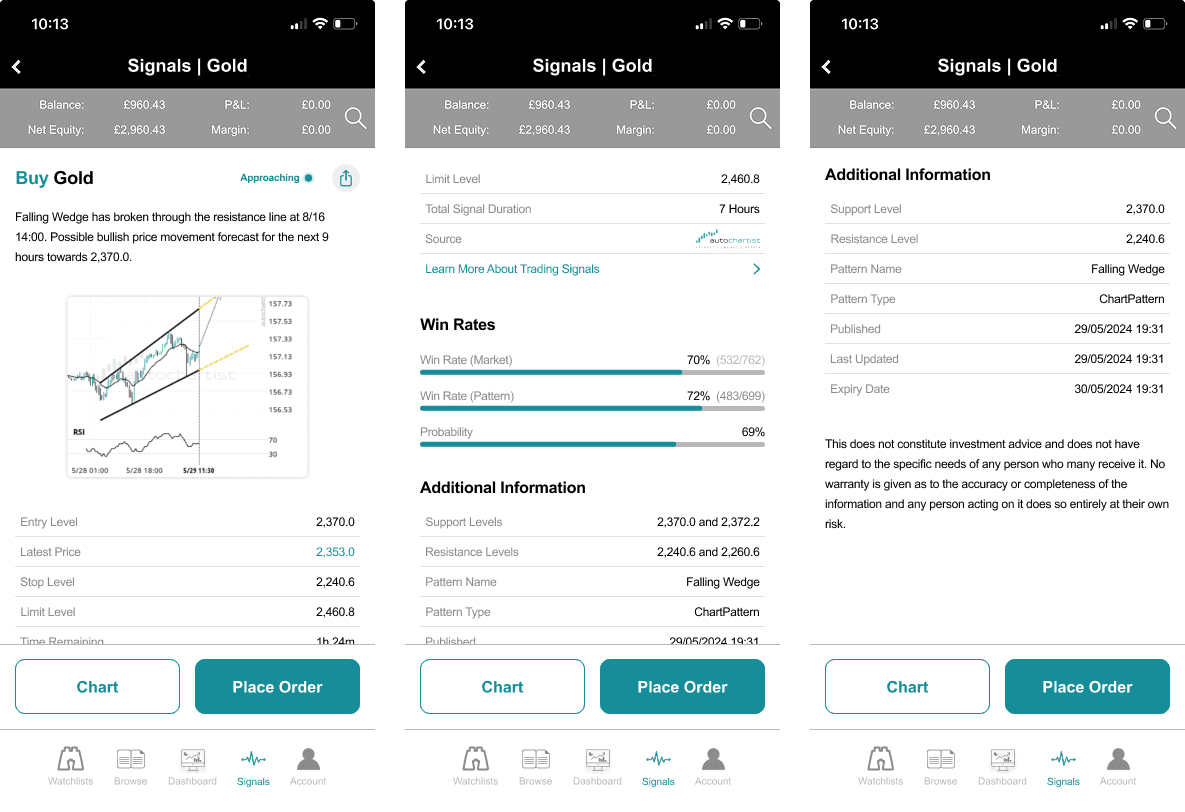
Treat every visual as proof. Captions make claims and annotations reveal the judgement behind the screen.
Best forRecruiter comprehension and product judgement
“The platform is easy enough to use. I just don’t always know what I should be looking for.
Illustrative synthesis · replace with verbatim research
The reframeThe real problem wasn’t access to analysis. It was the distance between seeing an idea and feeling confident enough to act.
Visual direction
Product focus
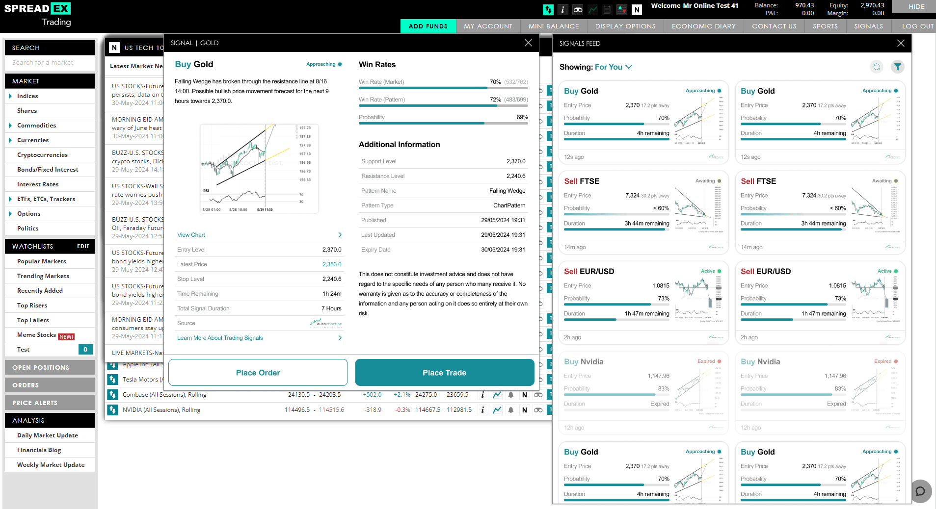
Give one product observation enough space to land. The interface is the evidence, not decoration around it.
Best forProduct craft and LinkedIn impact
Signals
More information
wasn’t the answer.
Make ideas easier to understand, then easier to act on.
Visual direction
Decision trace
Show the causal chain behind the interface, from user tension to product rule and commercial effect.
Best forTechnical fluency and trade-off reasoning
I can trade, but I do not know what to trade
The gap is confidence, not information
Curate, explain, then shorten the path to action
More useful intent reaches the order ticket

Rank quality above catalogue completeness.
Trade-off: A relevant niche idea may be hidden.Let beginners stop early and experts continue.
Trade-off: More content states to maintain.Use familiar states, filters and actions.
Trade-off: Native mapping adds integration work.Core principleEasy to use does not mean easy to decide.
Visual direction
Research notes
Let one human insight interrupt the product evidence. The system remains editorial, but the work feels observed rather than packaged.
Best forResearch texture and personality
“I understand how to place a trade. Finding one I actually believe in is the difficult part.
Illustrative synthesis · replace with verbatim research
ObservationInformation volume was being mistaken for usefulness.
KeepWatchlist behaviour was already learnt and trusted.
RemoveProvider-shaped terminology at the top of the experience.
Dense provider language
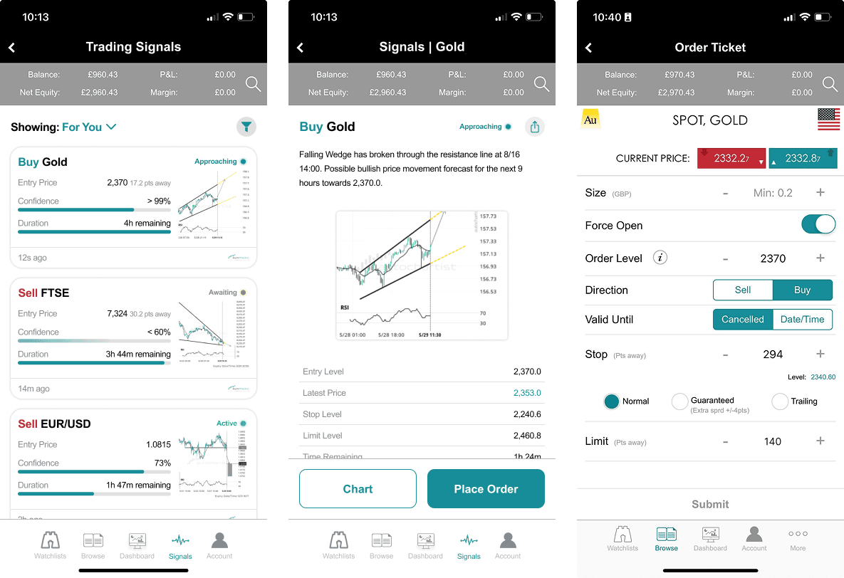
Curated, readable, actionable

Recommendation
Build around
Evidence ledger.
It communicates judgement fastest and scales across screenshots, research, metrics and diagrams without becoming a portfolio template.
Evidence ledgerCore framing, captions and comparisons
Decision traceCausal diagrams where logic matters
Research notesOne human fragment per case study
- 1
Every annotation states a decision. Never label what the screenshot already shows.
- 2
Every caption makes a claim. Screen names are metadata, not explanation.
- 3
Every metric carries provenance. Show the baseline, period and confidence.
- 4
One visual, one argument. Crop aggressively when context is not the point.